This is our original idea for the font/logo, which would be used, on our

We came up with the idea to use this logo on the digipak and the advert so it would show a connection between the two and also create a link between the imagery and the band.
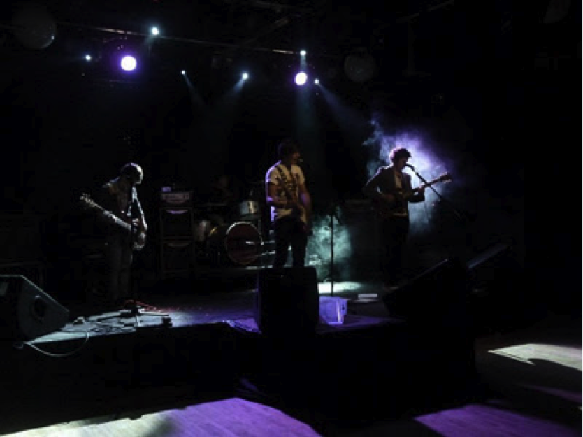
For the back cover of the digipak we wanted to use a live footage picture of the band since we couldn’t directly use a picture from the internet, Emily came up with the idea to take a photograph of her brother band and then put into black and white so it wasn’t too obvious that it wasn’t the actual band. The idea from using a picture of a live band was to give an insight into what the DVD would feature and want audiences expect to see from a live DVD. This is the photo we decided to use on our end product.
For the inside panels, we decided to take pictures of the band members from the video and again using the idea of abstract themes we decided to silhouette the band members into black which contrasts with the white background again alluding the theme of abstract designs and matching the colour scheme.
Below are the original pictures we use before editing them.


we thought that adding the lyrics within the digipak would give a more realistic image as most albums and live DVDs have included lyrics from their songs, but it would also allow fans to see the lyrics if they wanted to sing-along with the song. We kept to the them of white and black because this is a iconography of what most indie genres represent.
These are the final digipak panels.
FRONT COVER

INSIDE PANEL 1


dvd disc

back cover of digipak

No comments:
Post a Comment